Week 1 to 4 and Exercise
Design Principle
Week 1 - Week 4 : 30/ 8/ 22 - 23/ 9/ 22
Bachelor of Design (Hons) in Creative Media
Joan Chiam Zi Woei 0350211
Introduction
During the first week of class, we were introduced to the class and we were brief about what we will be working on in the future. Other than that we were also briefed about our first assignment.
Lecture 1:
Elements & Principles of Design, Gestalt Theory & Contrast
On the first lecture of the week we learnt about visual communication. It is used in a design to convey meaningful messages. To send awareness/ message to the targeted audience in order to achieve effective communication to the communities.
Elements of Designs
Point : A point is a single dot or mark that has position but is otherwise limited. It is a single entity in itself and alone it can act as a focal point or a stopping point in a composition.

Fig. 1.1 : Points
Line : A line can be vertical, diagonal, horizontal, and even curved. Lines can create shapes.

Fig. 1.2 : Lines
Shape : A shape is a closed form that consists of straight lines, curved lines or angles. Drawing a shape is the first step to creating an object.
Fig. 1.3 : Shapes
Form : Basic forms are three-dimensional figures. A form can be a man-made, geometric shape that is mathematically precise in all its angles and edges, or it can be a natural, organic form.

Fig. 1.4 : Forms
Texture : Texture is one of the elements of design that is used to represent how an object appears or feels.

Fig. 1.5 : Texture
Space : Space is the area that a shape or form occupies. It is also a background against which we see the shape or form.

Fig. 1.6 : Space
Colour : Color is used to portray mood, light, depth, and point of view.
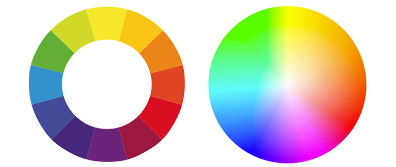
Fig. 1.7 : Colour
Contrast
Contrast is the difference between two or more elements in a composition, where the more difference there are between the elements, the easier they are to compare between each other. It is the juxtaposition of strongly dissimilar elements.
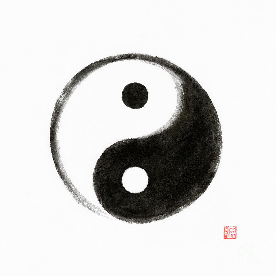
Fig. 2.1 : Contrast
Gestalt theory
The human eyes are perceives to see patterns, logic and structure. Gestalt principles/laws are rules that describe how the human eye perceives visual elements which is aimed to show how complex scenes can be reduced to more simple shapes.
/gestalt-laws-of-perceptual-organization-2795835-01-8f488f3d191048a0bc42e23ff9470042.png)
Fig. 2.2 : Gestalt Theory
Balance
Balance is the distribution of visual weight of objects, colours, texture, and space. It is also the way for how composition is arranged. The two types of balance that we will look at are:

Fig. 2.3 : Balance
- Symmetrical - equally balanced design/objects
- Asymmetrical- unequally balanced design/objects
Golden Ratio
The Golden Ratio is a mathematical ratio. It is commonly found in nature, and when used in a design, it fosters organic and natural-looking compositions that are aesthetically pleasing to the eye.
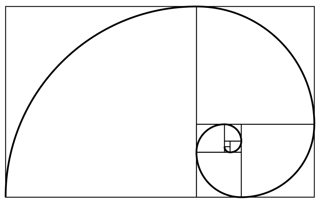
Fig. 2.4 Golden Ratio
Rule of Thirds
The Rule of Thirds is the process of dividing an image into thirds, using two horizontal and two vertical lines. This imaginary grid yields nine parts with four intersection points.

Fig. 2.5 Rule of Thirds
Emphasis
Emphasis the method artist uses in a design to catch the viewer's attention. Usually in the design, one area stand out by contrasting it with other areas. The difference can be in size, color, texture, shape and etc.

Fig. 2.6 Emphasis
Repetition
Repetition refers to using the same element over and over again in a design. It could make a work of design seem active therefore creating visual excitement that attract surface interest.

Fig. 2.7 Repetition
Movement
Movement in design showcases the action and gives the control over what the viewer might expect to see next. Movement also helps to create a guide for our eyes to look through the art from one element to the next. Movement in visual image can come from the kinds of shapes, forms, lines, and curves.

Fig. 2.8 Movement
Unity and Harmony
Unity which is also called harmony gives the design a sense of cohesion/coherence. It makes the design look whole and complete. Unity and harmony in art are used by artists to tie a composition together and help the composition make sense as a whole.

Fig. 2.9 Unity and Movement
Symbol
It is a sign, shape, or object that is used to represent certain things. In design, symbols can provide or convey information easily.

Fig. 2.10 Symbol
Tasks :
- Read through the MIB
- Watch the pre- recorded videos
- Set up e-portfolio
- Start assignment 1
Exercise :
Select 5 design principles out from the list and create 1 design for each chosen principle.
- Gestalt Theory
- Contrast
- Emphasis
- Balance
- Repetition
- Movement
- Harmony & Unity
- Symbol
- Word and Image
Each design must contain
- Recap of the selected design
- Design process
Principle 1: Word and Image
Inspiration
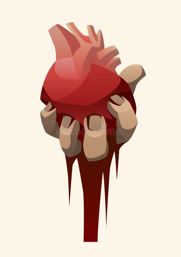
The first design is word and image. The word that I chose was lie and when I thought about lie, it reminds me of betrayal. The hand holding onto the heart is because when you trust someone you give them your sincerity which also symbolize giving your heart out to someone. And the broken heart was the result of getting betrayed.
.png)
Lecturer's feedbacks : It was suggested to me to take away the hand and focus on the heart and word instead.
Progress
I tried to make the heart more realistic by referencing from a drawing of realistic heart. So that it would not look too dull and simple in compare to a heart shape drawing.

After I finished the drawing I realized that the word made less sense and a bit too plain.

After some consideration I decided to change the word and add some more details to improve the design.

On week 3, the design was approved. The lecturer's feedback was to move the drawing towards the center of the canvas so that it would be balance.

This is the final design. The band aid symbolized healing and caring for oneself. The plants symbolized growth because when people start to learn about self love, they get to learn and improve themselves for the better.


Principle 2: Contrast
Inspiration
I wanted to make a contrast that is flower related when I came across this picture that was saved in my phone a long time ago so I decided to recreate this by contrasting the red spider lily flower with black background.

Figure by Tokyo Ghoul
Design#2
Progress
First of all I sketched out the flower I needed.

After that I add in the colours and details for the flower.

Lecturer's feedbacks : On week 3, the design was approved and the lecturer's feedback was to add some more flowers to make it look less empty and make it more balance.

Final design
In the final design I added a few more red spider lily flowers into the drawing. In this drawing the red flowers are in contrast to the black background. The combination is inherently aesthetically powerful, with red's association with the representation of courage and vigor while black represent fear and mystery.

Principle 3: Emphasis

Inspiration
I wanted to have a emphasis drawing that is noticeable immediately but without having too much exaggeration. That is why when I saw this picture on Pinterest, it grabbed my attention and inspired me. But I didn't just want plants for my design so I thought about adding koi fish to make it look more interesting.

Figure by Amouriaque
Design#3 Progress
First of all I made a simple background and start drawing the koi fish within the rectangular box I made.


Lecturer's feedbacks : On week 3, the design was approved as well and the feedback from lecturer is to make the koi fish a bit more outwards from the box.

Final Design
In the final design, I made the fish bigger and outward from the box. It does look better after the changes as the fish pop out more which is exactly what I was aiming for since this design is using the principle of emphasis. I only drew one koi fish as I did not want the other koi fish to distract the attention away from the main emphasis. The flowers were drawn to harmonize the design as koi fishes are usually kept in a pond in garden or park.

Principle 4: Repetition
Inspiration
For the fourth design, I was searching through the internet while looking for some inspiration and found out this drawing by a famous artist. The concept was cool and I found it interesting so I decided to make a design that with that concept in mind but instead of gold fish I wanted to use Koinobori which is carp-shaped windsocks that Japanese people put up during children's day.

Figure by Demizu Posuka

First of all I started with the outline of the koinobori. So that I'll can plan out the placement of the fishes.

Lecturer's feedbacks : On week 3, the idea was approved with no further comment other than I should try to make sure it fit the principle.
I started the design by applying colour to the biggest fish so that it can save me some time where I could duplicate and paste on some of the other fishes.

This is the finishing look for the koinobori. I tried to make them unique by not repeating the same colour. I also used another drawing style for the smaller koinobori to show the uniqueness of each of them.

This is what the design look like fully coloured.

Final Design
After some consideration I added some more details as the final touch for the design. I wanted to make a light that attract the koinobori's attention therefore that's the reason behind why all of them are heading towards one direction. I tried to make the design represent the principle of repetition while still remain the uniqueness of each koinobori as the windsocks represent each children to bless them with success and strength.

Principle 5: Movement
Inspiration
I saw this design while scrolling through Pinterest and it instantly remind me of the principle of movement so I wanted to take this as my inspiration. I liked the idea of sea creatures swimming in spiral while heading towards the surface so I want to recreate that.
.jpg)
Progress
I started the drawing the spiral direction of the sea creatures using the golden ratio as my guide.

I finished the colouring for the sea creatures. The reason why I gave them all the same colour is because the sea creatures are in deep sea that's dark. I also added highlights on the parts where the light would hit on the sea creatures.


This is the final design for the last principle. In the finishing part, I also added light rays effect on the design to make it look more realistic. For the design, I chose sharks as the main sea creatures that swim spirally because some sharks must swim constantly in order to keep oxygen-rich water flowing over their gills that's why I thought it would be a good idea to use sharks for this design. Unfortunately I did not finish the drawing in time to show the lecturer for feedback.

Reflection
Although I studied foundation in design, I'm still not the best at drawing therefore I struggled a bit while trying to create the designs. Even though I had a lot of ideas for the designs but due to my lack of experience I had to make it simple and less complicated so that I will be able to finish the exercise more smoothly without much problems. Overall, the exercise was hard for me but I'm glad that I had the exercise to practice and challenge myself instead of always staying in my own comfort zone. I also enjoyed the process of improving my skills.

Comments
Post a Comment